Color Communication
Color Communication
Edward Gibson, Richard Futrell, Julian Jara-Ettinger, Kyle Mahowald, Leon Bergen, Sivalogeswaran Ratnasigam, Mitchell Gibson, Steven T. Piantadosi, and Bevil R. Conway
MIT Department of Brain and Cognitive Sciences
We were investigating a centuries-old question in cognitive science: why do languages differ in the number of color words they use. Whereas the human eye can differentiate millions of colors (e.g., there are thousands of different shades of blue that we can distinguish when the colors are placed side by side), languages use a relatively small number (between 2 and 12) of color terms to divide up this vast perceptual space.
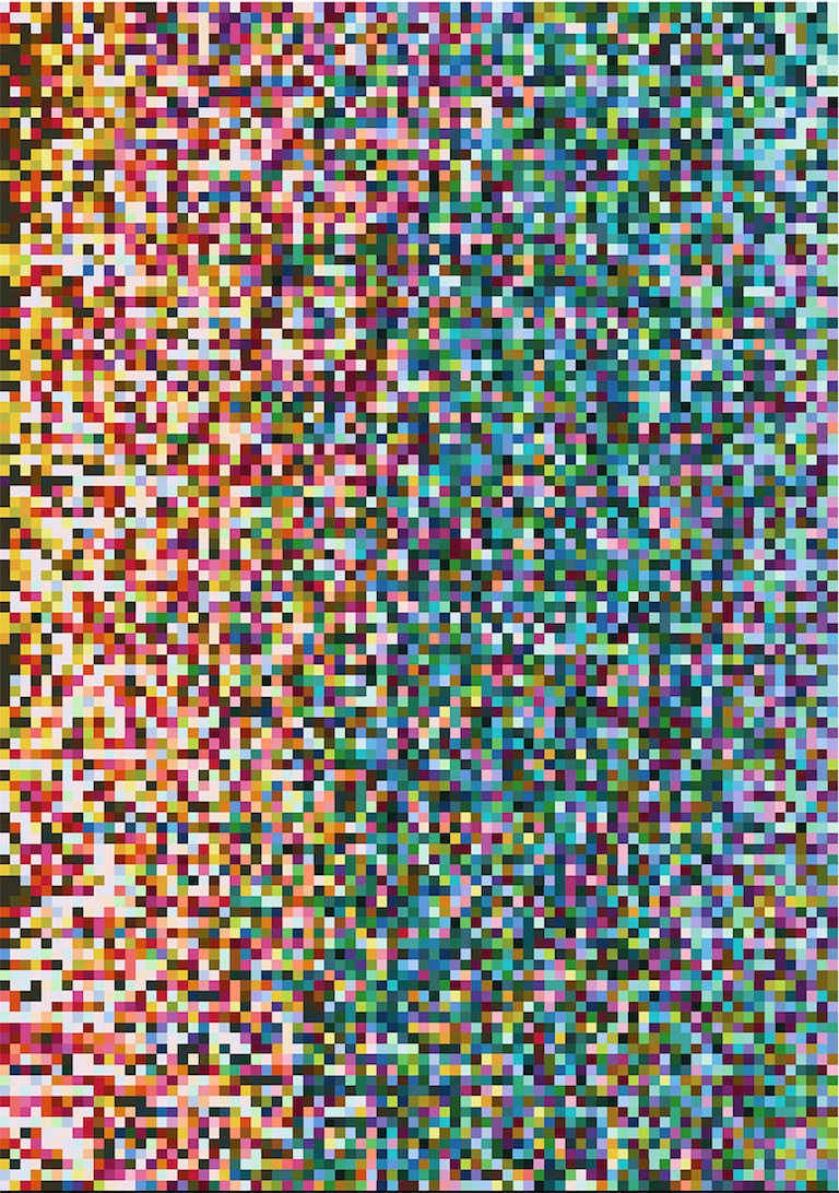
The image shows 80 Munsell color chips rank-ordered left-to-right by how effectively the color of the chip is communicated, using the words in a particular language. Each row shows data for a given language, including the 110 non-industrialized languages of the World Color Survey, plus English, Bolivian-Spanish, and Tsimane’ (data that our lab gathered). The 80 color chips were selected so as to be maximally saturated and evenly spaced across the color space (any pair of neighboring colors are similarly easy to distinguish perceptually). The key result is that across all languages, regardless of the sophistication of their color-naming systems, warm colors (e.g., red, orange, yellow, brown) are communicated more efficiently than cool colors (e.g., blue, green), as evidenced by the concentration of warm colors in the left side of the image. Efficiency is defined in terms of information theory: how many yes/no questions (bits of information) it would take an idealized listener to guess what color chip an idealized speaker is labeling with a color word. Our analyses show that all languages have more color words to describe the warm part of the color space than the cool part. These results provide evidence for a universal pattern that reflects the usefulness of color to behavior: warm colors are more likely to appear in foreground objects (e.g., humans, animals, fruit, berries) that humans are more likely to have the need to talk about, whereas cool colors are more likely to appear in backgrounds (e.g., sky, water, leaves, grass).
